Our founder Laura recently bought a home in Louisville (the new home base for The Stated Home!) and found herself in the market for some new white-ish paint colors. After scouring the internet for advice (and getting overwhelmed by the hundreds of different options there are to choose from), she came up with a list of the white paint colors that kept coming up again and again. And instead of keeping that list to herself, we thought it would be fun to share it with you guys!
To make the list, the paint had to be either a Benjamin Moore or Sherwin-Williams color. These two brands are typically easy to find and cost way less than Farrow & Ball or Portola (where do you even GET those fancy paints anyway?).
Before we get to the recommendations, we wanted to share some good tips to think about when painting white walls:
- If you decide to go white in one room, you should make most of your other rooms white as well. If one room is white and all the others have brighter walls, it will look like you forgot to paint a room.
- Pay attention to existing finishes you can’t change, like cabinets, countertops, and floors. If these lean warm, choose a warm white. If they are cool, pick something with cool undertones.
- Make sure you add warmth to white rooms with furniture and accessories in natural wood tones.
- For walls, pure whites can be tough to work with. Instead, choose something that has the tiniest bit of hue or is a super light version of a neutral color (gray, beige, or greige).
- And the most important tip: TEST YOUR WHITES ON THE WALL FIRST. White is a super tricky color and can look very different from house to house and room to room. It can even look different in the same room as the light changes throughout the day. Buy small samples of a few colors you are considering and either paint big squares right on the wall or paint them on poster or foam board (you can then move those around the house to see how they look). It’s a little extra cost and time, but way less than having to repaint when you realize your white is way too yellow or green.
Okay, on to our lists!
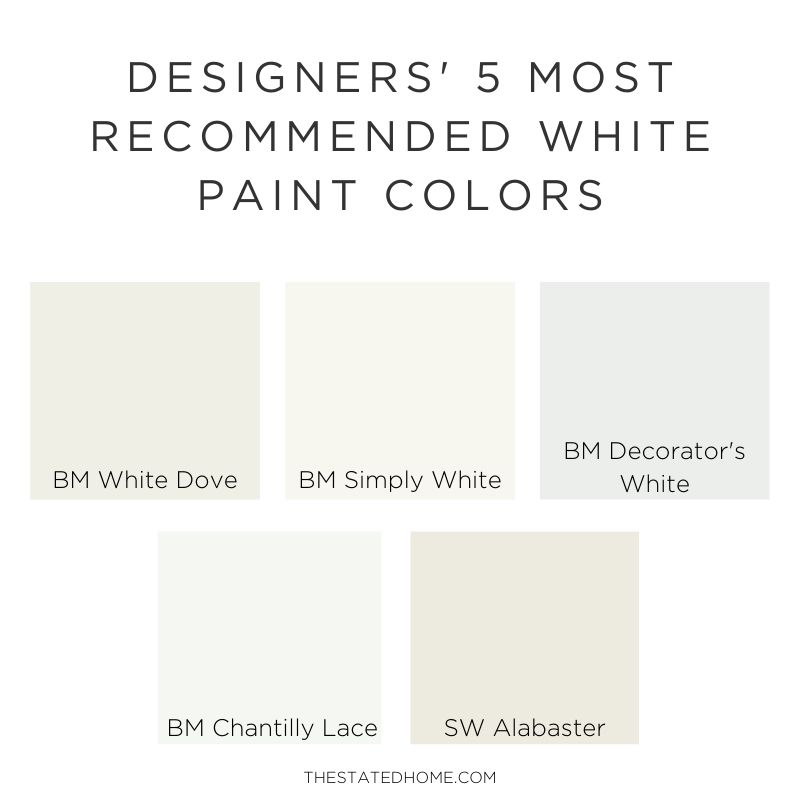
The Top 5
These five colors were by far the most recommended and kept coming up again and again.
- Benjamin Moore White Dove (OC-17) – This color was the most recommended white for its ability to look both crisp (subtle gray undertones) and warm (creamy without being yellow or tan). It’s a great option for bedrooms as well as large spaces like kitchens and living rooms (hence the versatility) and looks great with oak floors.
Designer Tip: Use on both walls and trim but change the sheen: eggshell on walls and semi-gloss on trim. - Benjamin Moore Simply White (OC-117) – A very close second, Simply White is loved by many designers for being a good “pure white.” It reads “crisp without being sterile” because of a whisper of warm undertones and is a good option for trim and cabinets. It is also great if you want a crisp white in a more traditional space.
Designer Tip: Use on walls to brighten spaces with little natural light. - Benjamin Moore Decorator’s White (OC-149) – A bright, clean white that leans cool – think of it as a soft, true white. An easy choice for trim and cabinets, it also works great as a wall color in contemporary spaces without being stark.
Designer Tip: Use as a trim color with gray walls. - Benjamin Moore Chantilly Lace (OC-65) – Another white appreciated because of its pure white color that won’t make your home look like a sterile doctor’s office, it has no pesky undertones and can go warm or cool depending on the other colors around. It looks good on cabinets or on walls in contemporary spaces and can be used to brighten dimmer rooms.
Designer Tip: A no-fail choice for trim and ceilings. - Sherwin-Williams Alabaster (7008) – A soft, barely off-white that leans towards cream to create a calm space. It’s very similar to the #1 color above, Benjamin Moore White Dove, so if you’re considering that, you may want to sample this too. Good to use in bedrooms (promotes relaxation) and on trim when you don’t want a pure white.
Designer Tip: Use if you have existing warm tones in the space.
Those first five were pretty easy to separate out, but there were a bunch of other options that kept popping up. Here they are, in no particular order:
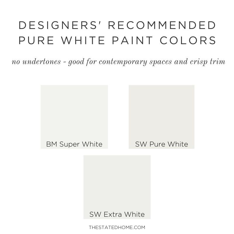
The Pure Whites
These colors are great if you don’t want any undertones – you’re highlighting art, have a contemporary space, or need a clean trim or cabinet color.
- Benjamin Super White (OC-152) – With truly no undertones, it will make colors pop.
- Sherwin-Williams Pure White (7005) – It has a hint of warmth, but can be used with warm or cool colors.
- Sherwin-Williams Extra White (7006) – A very white paint with an ever so subtle cool undertone, it’s crisp and works great with cool colors and contemporary spaces.
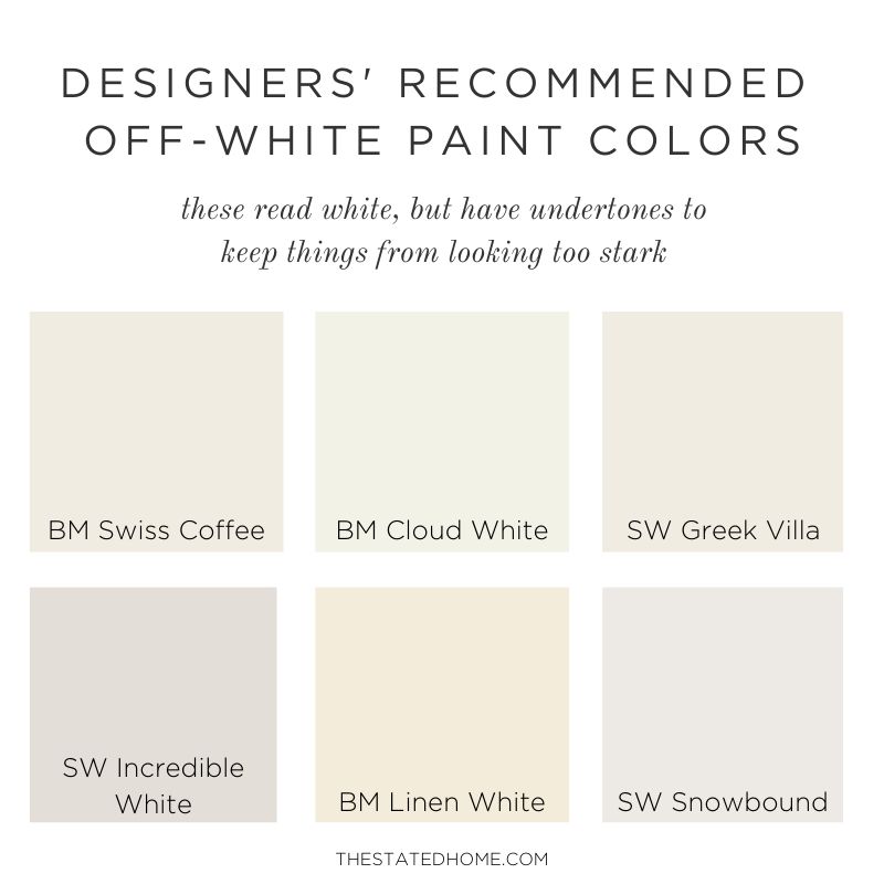
The Off-Whites
These colors read white, but definitely have undertones. If you have a traditional space, consider something with warm undertones. Cool undertones work well with existing cool gray colors.
- Benjamin Moore Swiss Coffee (OC-45) – Ivory without looking yellow, this warm white also works in contemporary spaces.
- Benjamin Moore Cloud White (OC-130) – A soft, warm white that gives you a good neutral without being stark, this one works in both traditional and contemporary spaces. Think of it as slightly whiter version of Benjamin Moore White Dove.
- Sherwin-Williams Greek Villa (7551) – A warm, bright white with slight blue undertones that doesn’t change much in different light. Almost creamy, this is good for both walls or trim.
- Sherwin-Williams Incredible White (7028) – This has just enough of a warm gray hue to contrast slightly with pure white trim, but the walls will read white without undertones of other colors.
- Benjamin Moore Linen White (912) – If you decide you want walls that look more ivory than white, this is a good choice. Without going too yellow, this color can make a space glow and looks especially good at night. Want to keep the creaminess down? Then mix this 50/50 with Decorator’s White.
- Sherwin-Williams Snowbound (7004) – The only cool white on this list, Snowbound looks like a true white, but has a hint of greige that keeps it from looking stark. A good choice for formal spaces or cabinets.
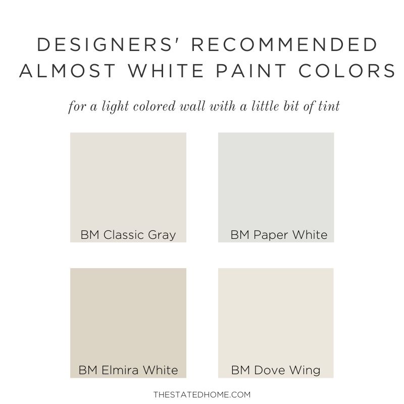
The Almost Whites
These colors give you light walls but contain just enough tint to look like an actual color. They are a good choice if you are worried about your space looking too stark or if you want to have more contrast between your walls and white trim.
- Benjamin Moore Classic Gray (OC-23) – Laura had this on the walls of her old house and didn’t get tired of it over the 10 years she lived there (which is saying something). This is a soft, warm gray that can read white.
- Benjamin Moore Paper White (OC-55) – A very subtle gray that reflects different tones, Paper White works well in rooms that get a lot of sunlight and for those with gray and white finishes, like a Carrara marble counter.
- Benjamin Moore Elmira White (HC-84) – A light beige with gray undertones, this warm color can lean gray or taupe depending on what else is around. The result: It will look good with most furnishings. It’s a good choice if you like to change things up from time to time.
- Benjamin Moore Dove Wing (OC-18) – A very light greige, this warm color creates a more natural look than doing white walls.
Hi, I have cream color cabinets and am looking for a warm white that won’t compete with the cabinets or make them look dull or dingy. I am considering Greek Villa or Chantilly Lace. My kitchen gets moderate light. Any recommendations? Thank you!
I don’t think Chantilly Lace is a good choice as it doesn’t have any warm undertones. I would think Greek Villa would be better because there is some warmness to it. BUT, the best thing you can do is paint some swatches on the wall next to the cabinets – it will help immensely. From my own experience, I thought for sure I was going to do White Dove in this house, but once I got a swatch on the wall it looked a little muddy. I ended up going with BM Simply White, which had the same tones as White Dove, but was whiter. Simply White might be a good option for you too – it is warm, but still looks white and crisp. Let me know what you decide!
Hello,
I’m considering both white dove (eggshell finish) for walls, (flat) for ceiling and (semigloss for trim), it after reading your blog I may go with simply white for walls. What is the best white color trim and ceiling color if I choose to go with simply white? Or is this all too much white? We have dark teak wood shaker cabinets we hope to paint white in the future.
Also we don’t get much natural light in the bathrooms or our master which is why I’m considering simply white.
Thanks!
I would paint some swatches of both White Dove and Simply White on your walls. I was in the same position in my own home – I was going to do White Dove, but after I got it on the walls it looked a little muddy in my spaces that didn’t get light so I went with Simply White. I painted walls, trim, and ceiling all in Simply White. It has warm undertones so it doesn’t feel sterile to me. One benefit of doing something more white is that if down the road I decide I’m sick of all the white I can repaint the walls and know the trim will still work. Good Luck!
I am really stuck on an off white paint for my whole house since its an open floor plan. I don’t have many windows and do not get much sun. Which off white would you recommend for dark spaces?? I want to stick to something warm but not muddy. Thanks!!
The BEST thing you can do is pick 3-4 colors and paint swatches on several different walls in your space. It’s hard for me to suggest a color since flooring and cabinetry color will dictate what looks best. I think Benjamin Moore Simply White may be a good place to start, then pick one that is less warm (Decorator’s White maybe) and another maybe that has more of a tint.
Hi. We are doing our walls in Greek villa. What do you recommend for the baseboards, moulding, and doors? Would white clash with the Greek villa? I don’t want much contrast.
Thanks!
Hi Ali! A fail-safe choice would be do it all in Greek Villa, but change the sheen. It will look like a slightly different color with little contrast. Do the walls in Eggshell and molding and doors in semi-gloss. If you need a ceiling paint you can do Greek Villa in flat. Another option would be to have them custom mix a Greek Villa at 50% strength – it will look lighter, but still have the same undertones as the wall. Whites can look VERY different depending on the house and room so make sure you paint some swatches on the walls to make sure you like it!
I am thinking of painting a small bathroom all Simply White in different finishes. Is it too much to do the cabinets, walls, trim and ceiling in the same color?
In general, it is definitely okay to paint wall, trim and cabinets the same color – this is done frequently in kitchens. My only concern about a bathroom is that since there is not much opportunity for other finishes because it is small, it may end up looking a little sterile. If it is a primary bath, this may not matter as there would be windows and space for art or throw rugs, but if it is a small powder room I would consider doing the walls or vanity something different.
Would Elmira White be okay in a living room that is south facing. I have a lot of samples that are turning yellow and I guess it is because of south facing so looking for something that would keep neutral and wondering if Elmira would be good and do you know if Elmira would show pink as my sample of Edgecomb Gray is showing a hint of pink so any help would be appreciated. Thank you.
It’s really hard for me to say without being in the space – you’re on the right track looking at samples. I would paint some large swatches on the wall and live with it for a few days. I know lighting can make things tricky so try several different shades and see.
I am updating a 2006 tuscan style home. I like the idea of whole house white dove but I am thinking that dove wing might be better with the cherry cabinets and golden travertine tiles. Would white dove trim be good with dove wing?
It’s really hard to say because colors can look so different depending on the lighting and floor in your home. I would recommend painting a small sample on the walls and see how it looks. Updating Tuscan colors can be tricky – I recommend checking out the blog of Maria Killam (color expert). If you search “Tuscan” on her search bar a lot of helpful articles come up! She’s really good at color advice.
Hi, I’ve spent HOURS reading and watching about Sherwin Williams Pure White and Extra White. I have paint samples but not sure if I can get into the house to check the light because there is no house yet. I love seamless looks when the cabinets, walls, trim, ceiling are done in the same white but that wasn’t an option. The cabinets are a very ice bright. I’m afraid Extra White will look like I tried to match cabinets but failed and afraid that Pure White will look too yellow and or warm for the cool cabinets. Any advice? I will try and get in with my Samplize samples.
Thanks a bunch for any feedback!
mc
I would not go with a white paint color since matching would be difficult. I think the best bet would be to choose a “almost white” color that will still give you a light look, but will be noticeably different then the cabinets so no one will think you did a bad job matching. If the cabinets have a blue (cool) undertone, then choose a wall color that has that as well like Classic Gray or Paper White. PLEASE test these next to the cabinets before you start!
Used Oxford White with Edgecomb Gray walls and it looks dingy. How would you compare Super White OC-152 to White OC-151 and would one of these be a good white to go with Edgecomb Gray.
Hi Janice – let me first say that I am NOT a color expert and the advice in this blog and comments is just based on research from actual color experts and my personal opinion (which may or may not be correct). This is why I ALWAYS recommend testing colors in the space before you do anything I say. Now, onto your question, I think the issue is that Oxford White has cool, blue undertones and Edgecomb Gray is a warm gray. You should choose a trim color that is more “pure white” (for a crisp look) or one with warm undertones. Looks like Super White and White are both pure whites, but the Super White may still be a touch cool so White may be better? Please test both of these with the Edgecomb to see. If you wanted to go with a warmer white trim, I’m really loving Simply White (OC-117). Good Luck!
My house doesn’t get a lot of natural sunlight because I have a heavily treed lot and my house faces Southwest. I currently have the mid 2000’s cherry oak laminate floors which add to the darkness of the home (I plan to replace these with something lighter in the next year or two). I was looking at SW Snowbound, Incredible White, Repose Gray and Agreeable Gray. Want to brighten up the space as much as possible. Appreciate any guidance! Thanks.
I would suggest to paint some swatches in different rooms of the house and see what you think! I would also give some thought as to the flooring you will be replacing so you can make sure the paint will go with that. I wish I could be more help, but it’s hard without being in the space.
Moving into a new house with dark cherry wood cabinetry. They’re beautiful. Although I have always had and loved white cabinets, I’m excited to try something new and not let my first reaction be to paint these already lovely cabinets. The hardware will be a brushed brass. I would like a white that compliments the warm tones but will still brighten the space. There’s quite a bit of natural light so I’m considering White Dove. Would you agree or have another suggestion I should sample specially with the cabinetry in mind? The selected white will be used throughout the whole house.
Sorry for the delayed reply Morgan! You’ve probably already done this project, but I think White Dove could be a good choice – the best way to figure it out is to paint some swatches on the walls throughout the house and see! Let me know how it turned out if you can.
I have antique white trim everywhere and want a nice wall color that is close to white or beige. Any suggestions?
Try one of the “almost white” colors mentioned in this blog – maybe Elmira White or Dove Wing? Paint some swatches on the walls next to the trim and see how it looks.
Hey! I’m looking to use SW Alabaster on walls in a great room with cathedral ceiling. Will it be ok to use Alabaster on the ceiling and trim too, just a different sheen? If so, what sheen where? We will have wooden beams on the ceiling to bring warmth to the room, along with some neutral furnishings and wood and metal accent tables.
Yes! Paint all of that the same color. Use eggshell on the walls, flat on the ceiling (or use the ceiling specific paint from SW), and semi-gloss on the trim. Good luck!
What are your thoughts on Benjamin Moore Twisted Oak Path?
Not familiar with that one!
Hi. I’m late to this conversation but have a question. I’d like to paint my bedroom white but have color in all my other rooms. Your comment that only one white room may look unfinished makes sense. I love “simply white” and have it on all of my trim in my bedrooms. Is there a slightly different white that you think would contrast well with the simply white? I’m wondering about “classic gray” on the walls with simply white on the trim and ceilings. Or do you think “Swiss white” might work well? Any recommendations you have would be helpful to get me started in buying a few sample paints. Thanks so much.
MaryJo
Sorry for the delayed reply! You’ve probably already selected. I love classic gray, or swiss coffee may also look good. What did you choose?