I’ve been in my house for almost two years and have still only repainted the two rooms I did when I first moved in. For those walls, I chose Benjamin Moore’s Simply White because I did not (and still don’t) have a design plan and needed something that would work with whatever I decided to do. Throughout the rest of the house, we have super saturated colors that pay homage to the mid-90s, but the time to tone those down has come. My craving for something neutral, yet with a touch of color – and more interesting than white – led me down the rabbit hole of gray paint colors.
Much like when I started researching white paint colors, I realized that many of these gray shades come up repeatedly recommended. So, to help you and myself, I’m creating a list of those oft recommended paint colors to make it a bit easier to find one that will work. (Note: To keep things attainable, I chose either Benjamin Moore or Sherwin-Williams paint since those brands are typically easy to find and are reasonably priced.)
TRENDS, TONES, AND TIPS
While I am seeing a definite departure from all-gray interiors of recent years, gray remains a popular choice for wall color. The white wall trend has been good to us, but opting for a light shade of gray that reads white will give a room more depth. A bit of color on the walls also provides a great backdrop for décor.
Grays can vary widely with undertones from green to blue to brown, making it a versatile paint choice. Keep in mind that colors may look different in your specific room with your specific lighting. We strongly recommend testing your chosen shades on your walls before making a commitment. The best way to do this is to paint colors on white poster board (so that your current wall color doesn’t skew the look), or there are websites like Samplize that can send you large peel-and-stick samples to try out on your walls.
Here are some additional things to keep in mind when painting gray walls:
- All gray paint has undertones, usually blue, green, or beige. The key to choosing the right one is to make sure other fixed features have the same undertones – floors, cabinets, etc.
- Don’t make everything else in the room gray – those all-gray rooms of recent years are starting to look dated.
- When choosing trim color, make sure it has the same undertones as the wall color – warm grays and greiges should have trim with some creaminess (Benjamin Moore Simply White or White Dove), while cool grays need white with cool undertones (Benjamin Moore Chantilly Lace could be good here). Or if you want a bright white trim, choose a white with no undertones (Benjamin Moore Super White or Sherwin-Williams Pure White or Extra White).
- Don’t color match – meaning if you choose a Benjamin Moore color, you should purchase it from a Benjamin Moore retailer. When you try to have Home Depot or another paint supplier match your paint, the subtle undertones of a particular shade could get lost. (I don’t recommend color matching in general, but it should especially be avoided with these nuanced colors.)
THE MANY SHADES OF GRAY
From crisp and cool to soft and warm, gray can have many different tonalities. Take a look at designers’ most recommended range of gray paint colors – and the ones I’ll be choosing among (soon!) when I paint the rest of my house:
The greige colors
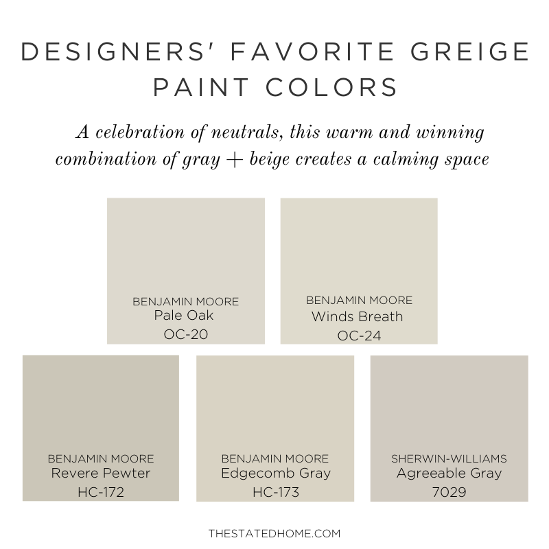
Just like it sounds: gray with beige. We see interiors going away from cold gray and using these warmer tones instead. I recommend looking at these colors first to give your space an updated look. These warmer colors will pair well with natural materials (think jute rugs and woven shades), rich leathers like camel, and ivory drapery and upholstery (just use performance fabrics on that sofa!). Greige colors will look totally different depending on the light in the space – cooler north-facing light will make it look more gray, while warmer south-facing light brings out the beige. This is why it’s important to try these colors out in all the rooms they’ll be in to make sure you’re happy with your choice.
- Pale Oak (Benjamin Moore OC-20): Touted by many designers for its “go-with-anything” capabilities, Pale Oak is cozier than an off-white wall, but provides a beautiful neutral backdrop. It looks good with décor of almost any color and works with a variety of flooring colors. In rooms that get a lot of natural light, it can read more as an off-white, so make sure to use a bright white paint for your trim to bring out a contrast. Keep in mind that Pale Oak can read a little pink/violet in certain light so this is one to definitely test.
- Winds Breath (Benjamin Moore OC-24): VERY similar to Pale Oak, but a touch darker with a bit more gray. Another versatile neutral background, this color can go with a variety of finishes, making it a great pick if you have a lot of different things going on in your space.
- Revere Pewter (Benjamin Moore HC-172): A darker greige option, this color is a good choice if you want your room to visibly have color on the walls, but still stay neutral. It will give you a more saturated color without overwhelming a space, and looks great with pops of bright color like pink, orange, or turquoise.
- Edgecomb Gray (Benjamin Moore HC-173): Lighter than Revere Pewter, Edgecomb Gray has the fewest undertones of the greige colors – it won’t read green like some of the others might.
- Agreeable Gray (Sherwin-Williams 7029): A very popular paint color with just enough hue to read as a color and not just white. Like other greiges, it can go well with most other colors in the room, but because it has a deeper hue, some undertones may be more obvious depending on the room and the light.
THE NEUTRAL GRAYS
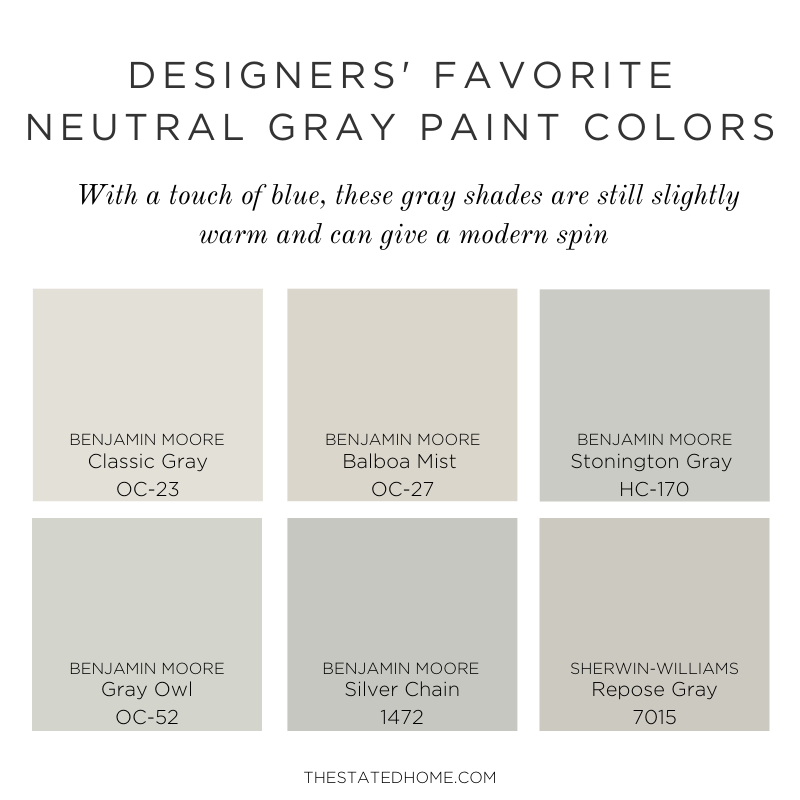
Simply put, these shades are not too beige and not too blue – these balanced colors are not as warm as the greiges and manage to not veer too cool despite their undertones. They’ll provide a nice backdrop for your décor and can modernize warmer wood tones.
- Classic Gray (Benjamin Moore OC-23): A longtime favorite of The Stated Home, Classic Gray was mentioned in our white paint blog because of its light, almost-white shade. I had this on the walls of my previous house for more than a decade and never got sick of it. A great option if you need to brighten up a space.
- Balboa Mist (Benjamin Moore OC-27): I went back and forth on whether this belonged in the greige section or this section, and here we are – it’s the warmest option under Neutral Grays.
- Stonington Gray (Benjamin Moore HC-170): Not too light and not too dark, Stonington Gray is sophisticated with just enough hue to give you a room with color. It can work in both traditional and modern spaces.
- Gray Owl (Benjamin Moore OC-52): Warmer than Stonington Gray, but its blue/green undertones still stand out. An overall calming color, this is a great choice for a bedroom. In certain rooms this can really read green so, like with any color, make sure to test it out first.
- Silver Chain (Benjamin Moore 1472): A medium tone gray, this will give your walls a truly gray look. This soft gray, also known as Harbor Gray (AC-25), can work in both traditional and modern rooms, but remember to keep the rest of your furnishings a different color. I love it in a bathroom with white cabinets and marble.
- Repose Gray (Sherwin-Williams 7015): Similar to Revere Pewter but not as warm, choose this if you want a warmer gray that will also brighten up a space.
DARK GRAYS
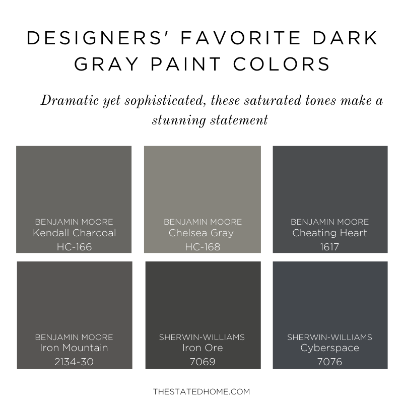
Sometimes you want to create a moody room or paint cabinets and furniture a darker color for contrast. That’s where dark grays can come in. Use these on both walls and trim for a sophisticated, yet dramatic look. We love how these colors look with brass accents.
- Kendall Charcoal (Benjamin Moore HC-166): A rich color with green undertones that is perfect for creating a moody space that still has some warmth.
- Chelsea Gray (Benjamin Moore HC-168): Lighter than Kendall Charcoal and with a touch more warmth, this is the perfect medium-dark gray and is a great choice for cabinets, vanities, or for creating a dark space without it feeling like a cave.
- Cheating Heart (Benjamin Moore 1617): A dark, dramatic color that is somewhere between black and navy with a tinge of brown to add some warmth.
- Iron Mountain (Benjamin Moore 2134-30): Close to black, this color is a deep dark gray with just enough warmth.
- Iron Ore (Sherwin-Williams 7069): One of our darkest options, Iron Ore is the perfect balance between warm and cool, reading almost black.
- Cyberspace (Sherwin-Williams 7076): This color can read almost super dark blue, making it a good option if you want dial down the moodiness of a dark gray. A whole room in this color would look dramatic, but it would also be a standout as an accent. Cyberspace would look great on cabinets as well.
Gray As a Color
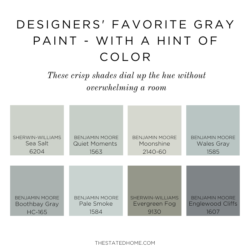
When a gray has strong undertones, it can start to look less gray and more like a color. These shades are good options if you are feeling the urge to add some color, but still want to keep things muted and somewhat neutral. I’m seeing a lot of rooms where the walls and trim are all painted the same color and I’m really loving the look. If you go that route, do the walls in an eggshell and the trim in a semi-gloss.
- Sea Salt (Sherwin-Williams 6204): A light gray with definite green undertones, this soft shade is good for smaller spaces where you want some color, but also want to keep a calm feel. I think this would look great in a bathroom with white marble.
- Quiet Moments (Benjamin Moore 1563): A pale blue/green/gray, Quiet Moments is a soft color that is good for spaces where you want to infuse some calm, ie. bedrooms and bathrooms. With fewer undertones than Sea Salt, this is a good pick if you’re feeling non-committal about a color.
- Moonshine (Benjamin Moore 2140-60): A light gray with green undertones, this will add a soft wash of green color to your room.
- Wales Gray (Benjamin Moore 1585): A medium-light blue gray with a touch of green, this sophisticated color will bring in some blue while keeping the space light.
- Boothbay Gray (Benjamin Moore HC-165): More gray than some of the other options in this section, Boothbay Gray has definite blue undertones, but will still give you that gray feeling.
- Pale Smoke (Benjamin Moore 1584): A soft blue gray, this color will add a sophisticated touch to your room. It can work with both warm and cool tones, so it’s a good choice if your design plan hasn’t been nailed down yet.
- Evergreen Fog (Sherwin-Williams 9130): A medium tone gray with obvious green undertones, this color will add some drama while keeping things subtle. I love how this looks with caramel leather and warm woods (and brass accents, of course).
- Englewood Cliffs (Benjamin Moore 1607): A medium tone blue gray, this gray will add some drama without darkening a space. With blue undertones (and a hint of violet) this plays well with other colors (think rich jewel tones like emerald). And don’t forget the brass accents!
Leave a Reply